SWIFT
scroll down
⌄
Swift
Swift is a non emergency medical transportation platform designed to bridge the gap between affordability, access, and care.
If you want to jump to what excites you:
Why
Uncertainty around medical urgency and cost drives non-critical cases to emergency services, increasing wait times and strain on EMS systems. Swift uses AI-guided decision support to help users assess urgency and choose appropriate care.
Background
Nearly one in four Americans need emergency medical care but struggle to afford it.
Solution
Swift reimagines non-emergency medical transportation with transparent pricing, certified care, and a calm, intuitive patient experience.
I worked collaboratively on the interface design, prioritizing clarity, accessibility, and a calm visual experience. As a team, we aligned on the UI direction in Figma and applied shared best practices to create an intuitive and supportive user flow.
Role
UX Designer
Industry
EMS, Healthcare
Our Deliverables
UI Design, User Research, Prototyping, Usability Testing, Service Mapping
Timeline
One Month
So What Did We Find?
Lets See…
What Were the Insights?
Clarity and guidance drive decision making
Clear care pathways reduced hesitation and improved task completion when choosing appropriate care.
Care should not be all or nothing
Providing trusted alternatives encouraged selection of non-emergency options, supporting more efficient use of emergency services.
Confidence improves follow through
Transparent pricing and supportive UI increased user confidence and booking completion.
What We Did With Those Insights
Insights informed design decisions focused on reducing hesitation, improving decision speed, and increasing confidence during care selection. Clear guidance, trust cues, and a guided request flow supported faster completion and more appropriate care choices.
Clear guidance improved decision efficiency and reduced hesitation during care selection.
Clear Guidance Under Stress
Clear next steps and safety confirmations improved flow completion by increasing user confidence.
Trust and Reassurance
A streamlined AI request flow reduced hesitation and improved decision speed and completion.
Fast Intuitive Flow
We Followed a Human Experienced Focused Process that Follows from Research to a Polished Solution.
-
We examined how people decide to seek medical help in urgent but non-life-threatening situations. Conversations with users revealed confusion around urgency, fear of ambulance costs, and a lack of clear alternatives when quick decisions matter.
Healthcare systems are under increasing strain, while patients continue to rely on emergency services for non-critical situations due to a lack of clear alternatives. Rising costs, longer response times, and growing user frustration highlight the need for a more accessible, user-centered way to connect people to appropriate care when timing and trust matter most.
-
We used qualitative and systems-focused UX methods to understand both patient behavior and EMS constraints. This included secondary research on EMS usage patterns, user interviews focused on decision-making under stress, journey mapping, and service blueprinting to identify gaps between urgency, access, and response.
We identified a gap between emergency services and everyday care, where users needed guidance, reassurance, and appropriate medical support without escalating to full EMS response.
-
We explored ride-share inspired models and care pathways that balance speed, safety, and trust while reducing strain on emergency systems.
-
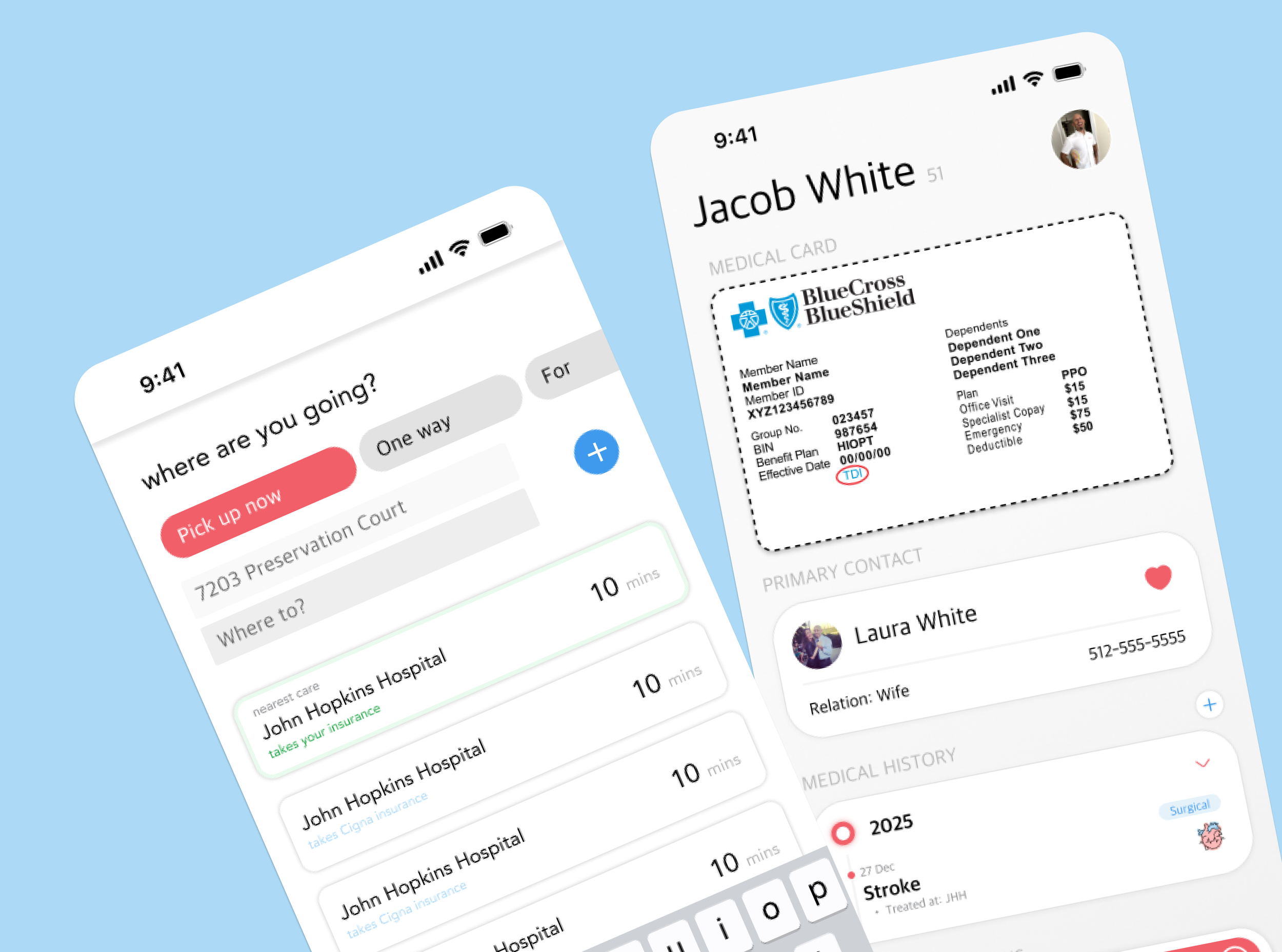
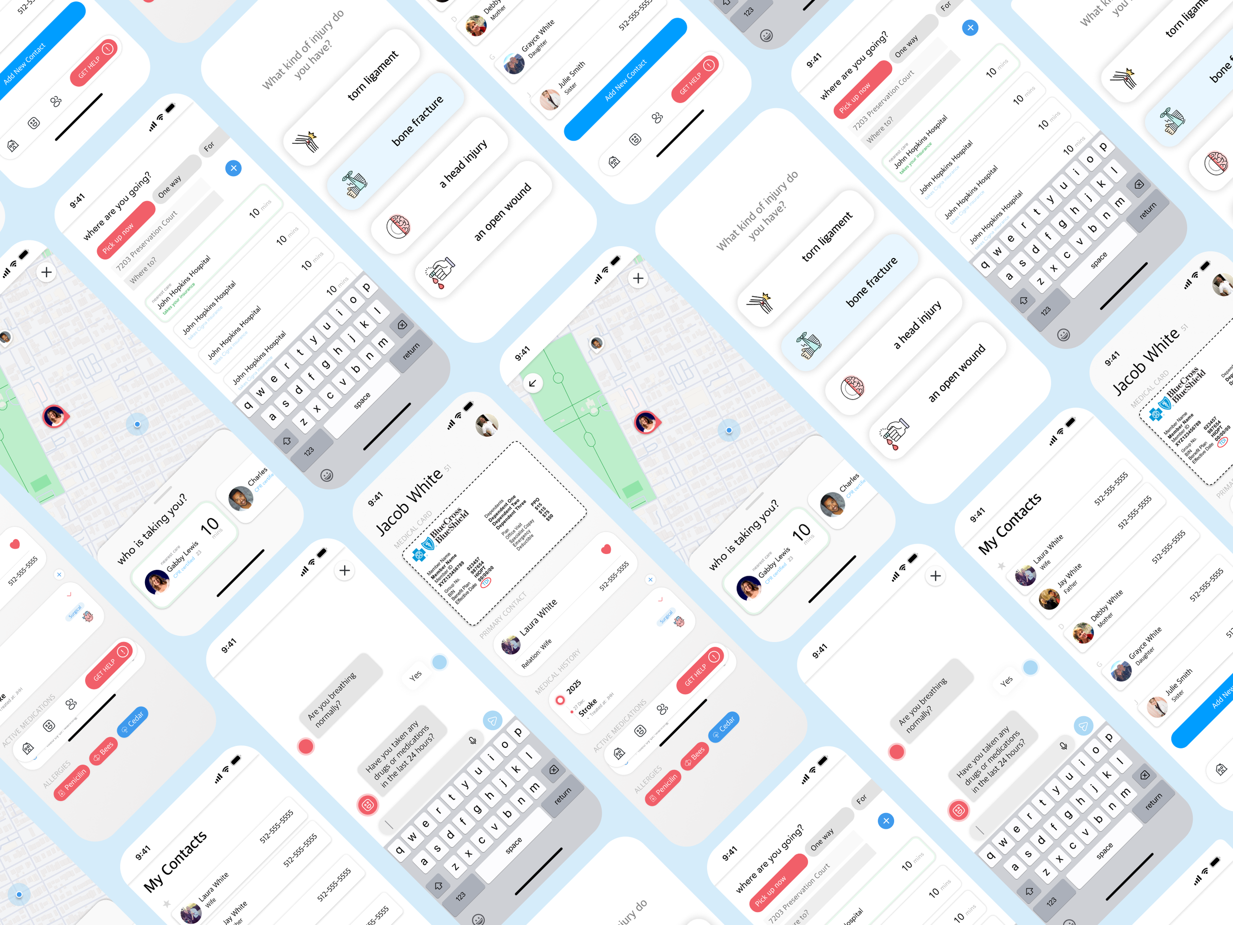
User flows were designed to minimize cognitive load, guiding users step-by-step through urgency assessment, transport selection, and care confirmation.
-
We created a clean, intuitive interface focused on clarity, accessibility, and confidence during high-stress moments.
-
Feedback helped refine language, decision points, and flow timing to ensure the experience felt supportive, reliable, and easy to use.
Impact
Swift reduced hesitation around care decisions by using AI-guided support and transparent pricing, helping users avoid unnecessary ambulance use and access more affordable transportation while supporting more efficient use of emergency services.
successful ride requests increased from 65% to 90%
average time to request a ride decreased from 2.5 minutes to 1.5 minutes
80% of participants said they would choose Swift over an ambulance for non-emergency situation
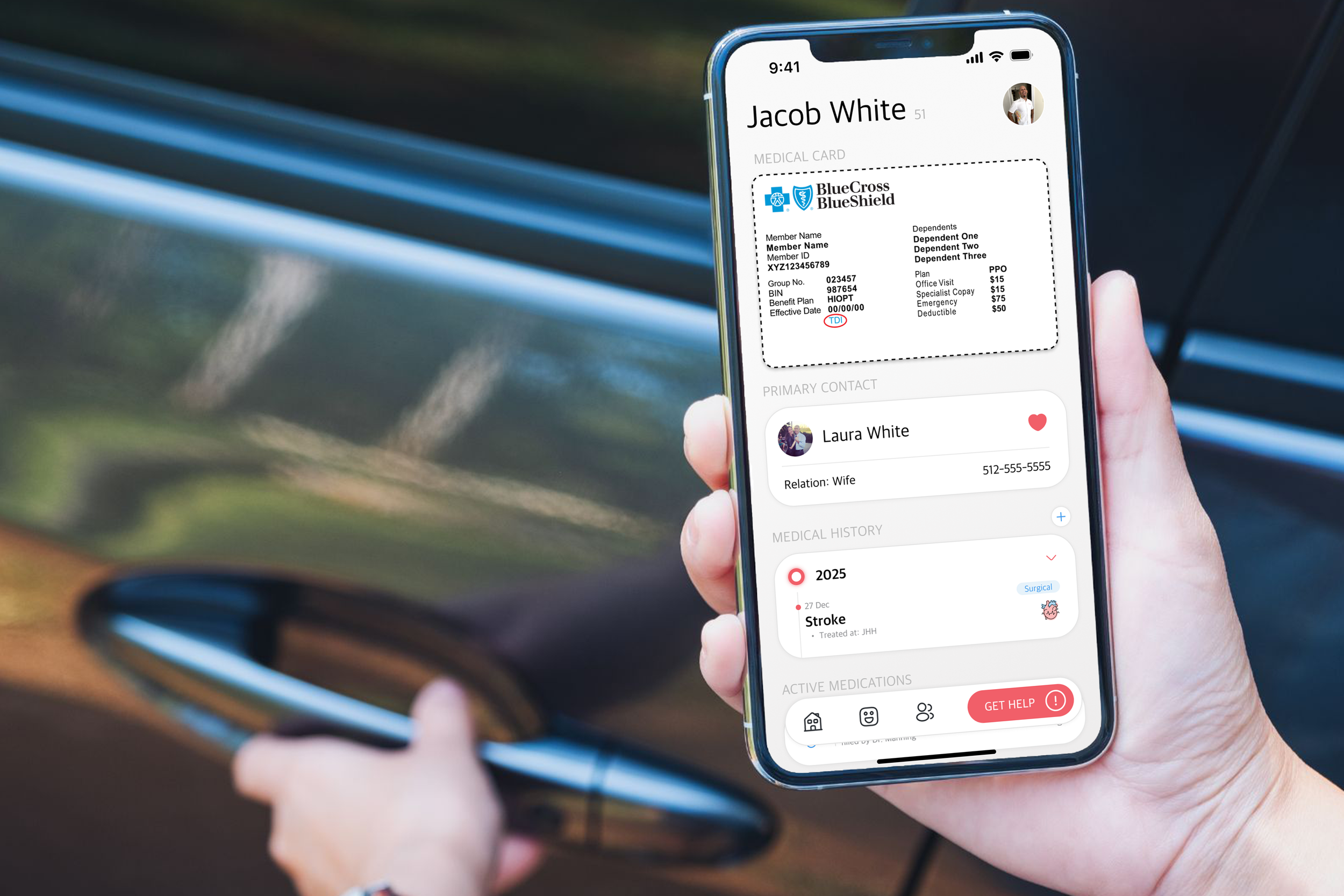
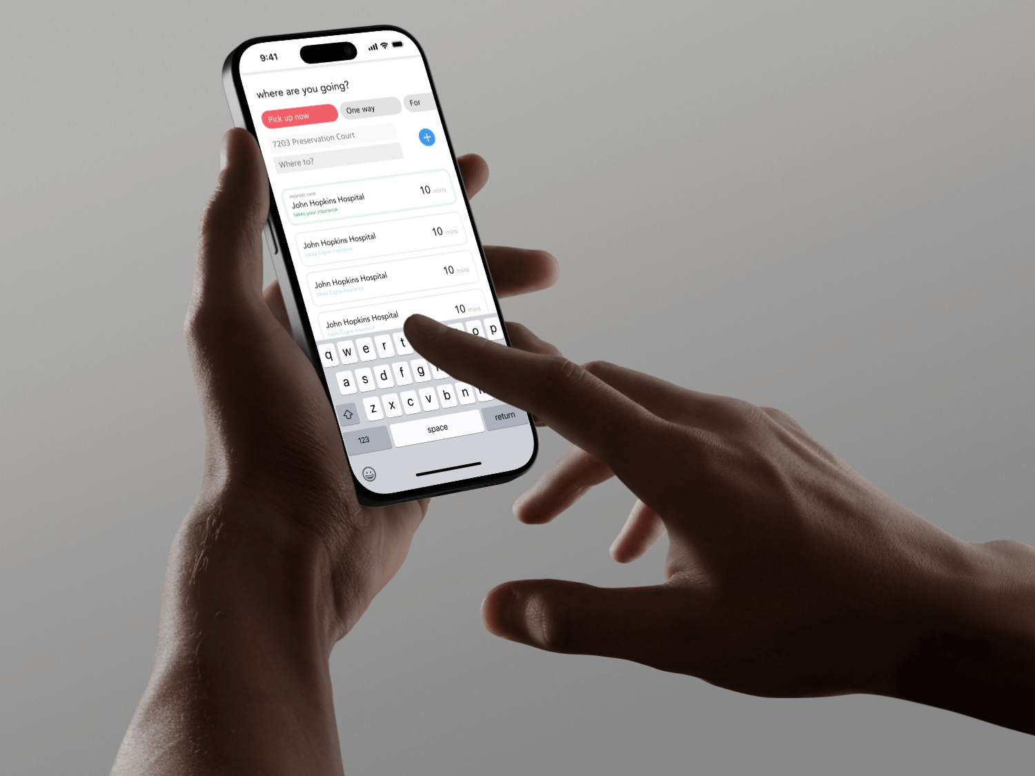
AI-GUIDED DECISION SUPPORT
Swift uses an AI-guided chatbot to provide immediate, scalable guidance that helps users distinguish emergencies from non-emergencies and route to appropriate care without escalating to EMS.
AI was used as decision support, not diagnosis, ensuring guidance remained safe, transparent, and user-controlled.
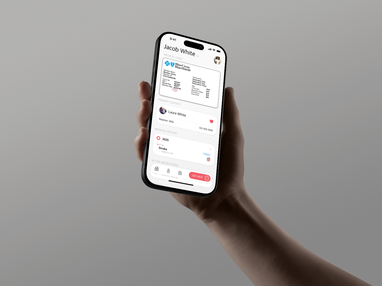
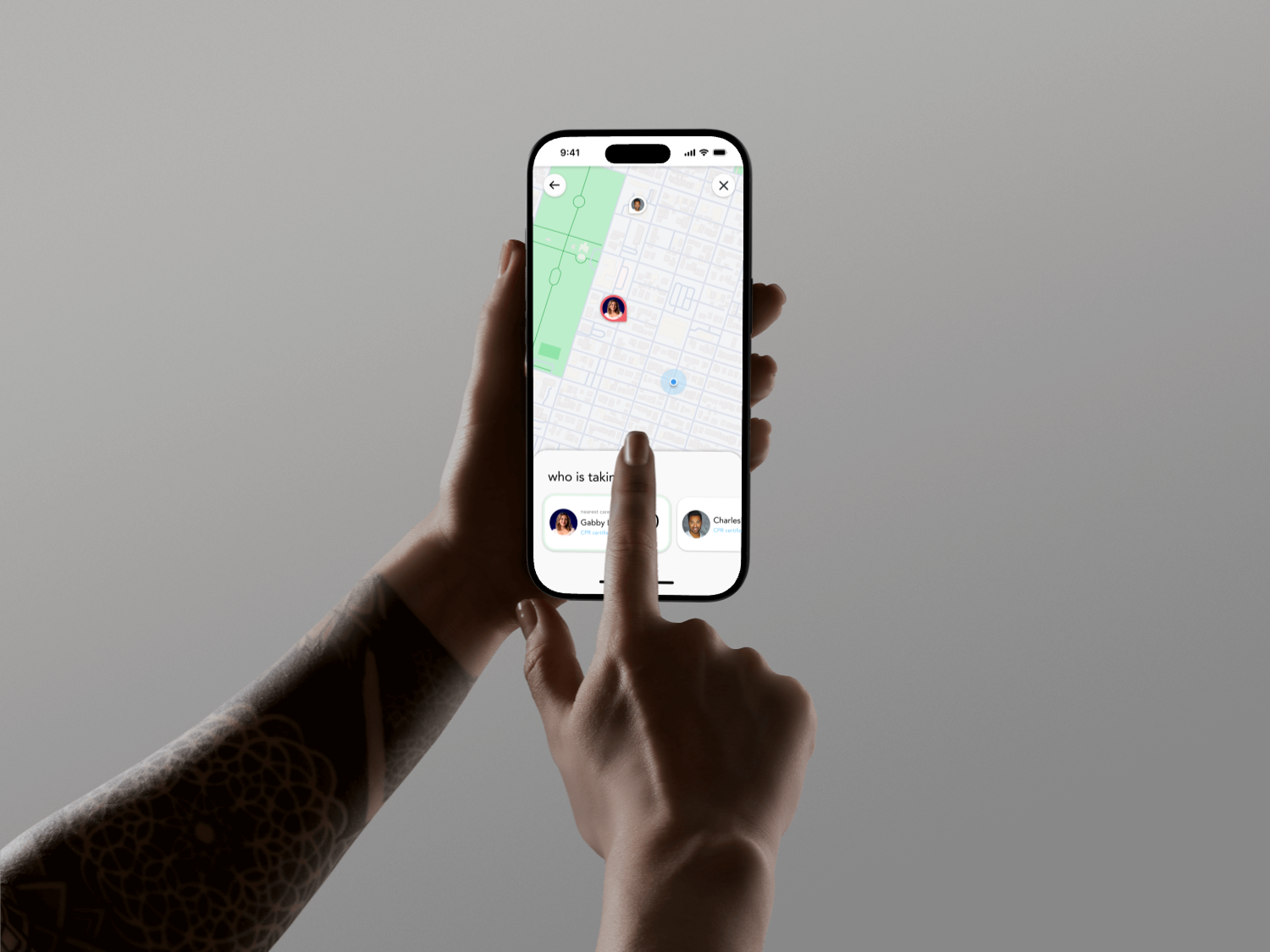
Our Final Concept
Swift is a non-emergency medical transportation app that uses an AI-guided chatbot to assess urgency and connect users with trained medical drivers for safe, affordable transport to care.
Our Vision Video
The Swift vision video shows how the app delivers fast, clear, and reassuring non-emergency care through a simple, intuitive experience.